The app citizens avoided, until they didn't
The brief
Where this started
Najm's vehicle accident evaluation app was functional but so complex that citizens avoided it, preferring WhatsApp and phone lines. I led the redesign: simpler workflows, less reliance on external channels, and a robust design system for the whole mobile experience.
The friction
What was getting in the way
An overly complex app that users actively routed around.
Preference for WhatsApp and IVR was undermining app adoption.
Unclear information architecture made accident reporting time-consuming at a stressful moment.
The response
What we built instead
Redesigned the mobile experience to simplify long processes and enhance usability.
New interfaces built on a consistent, scalable design system.
Real-time usability feedback through Tobii eye-tracking to ensure workflows matched user expectations.
The method
How the evidence led there
Evidence gathering
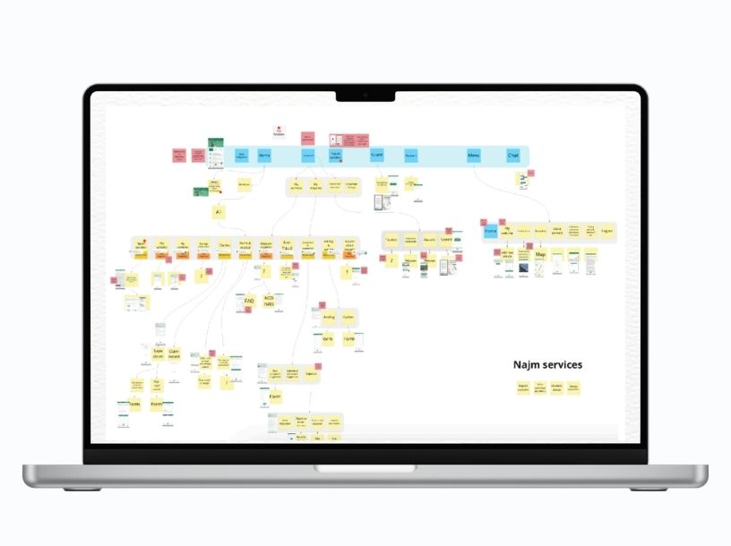
app-store review analysis, stakeholder and user surveys, and comprehensive function mapping in Miro.
UX benchmarking
quantitative and qualitative comparison against industry standards and competitors.
Heuristic evaluation
systematic review against Nielsen's principles, with issues prioritized by severity.
Action points
findings synthesized into a prioritized, stakeholder-validated improvement roadmap.
Flows and IA
detailed user flows and a rebuilt information architecture to reduce cognitive load.
Interfaces, A/B testing and design system
high-fidelity Figma prototypes, iteratively A/B tested; a scalable system of typography, colour, components and interaction patterns.
The result
What changed
Simplified reporting workflows on a platform serving millions.
A consistent design language adopted across the product, accelerating future development.
Evidence-backed usability improvements validated through testing rather than opinion.
Why it matters: The deepest end-to-end demonstration of my process, and of what it takes to keep a design language consistent across a live product at national scale.
Full walkthrough deck, Miro boards and Figma prototypes available on request (NDA-protected). Get in touch.